Manage Edit Post Logout Login

Power of Data Visualization

An infographic inspiration site.

« Back to blog

Québec Energy Flows and CO2 Emissions

http://www.sankey-diagrams.com/wp-content/gallery/x_sankey_213/dynamic/cesar_ca_01.PNG-nggid041014-ngg0dyn-500x0x100-00f0w010c010r110f110r010t010.PNG

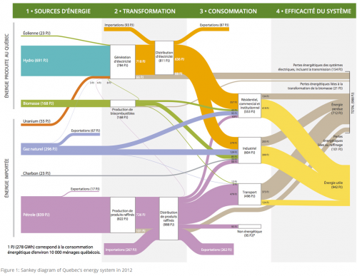
The CESAR (Canada Energy Systems Analysis Research) blog at www.cesarnet.ca had been idle for a while, but reopened 2015 with a post on Québec’s energy flows and related carbon dioxide emissions.

Via - Sankey Diagrams
Upvote Upvoted 0
Tweet
Like this post?
Subscribe by email » We'll email you when there are new posts here.
You're following this blog. Unfollow »
Follow this Posthaven »
Enter your email address to get email alerts about new posts on this site. Unsubscribe anytime.
Email address is invalid.
  • Home
  • About Us
  • Interactive
  • Video
  • Sex
  • Facts
  • Maps
  • Funny
  • History
  • Submit Tip
  • Contact

Posted