Power of Data Visualization

An infographic inspiration site. 
Since February 2010:   2443995 site views
ChartsBin.com is simple and interactive way of showing historical statistical data to chart or graph Advertise Here
Filed under

barchart

Do You Live with Your Parents?

Posted on June 30, 2011, viewed
times and has 0 comments

This chart shows the result of (one question) survey conducted by the World Values Survey (WVS) about housing: Do you live with your parents?
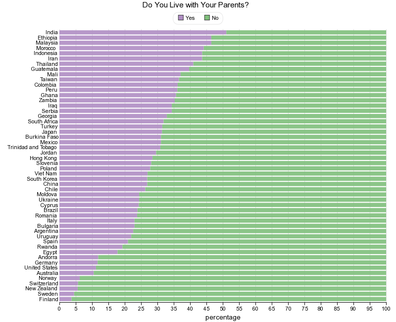
 via chartsbin.com

Read the rest of this post »

Filed under  //   World Values Survey   barchart   family   housing   infographic  

Modern web browser adoption better than expected: 71% run latest version

Posted on November 6, 2010, viewed
times and has 0 comments

Web developers fight a constant struggle: They want to use modern web browser features, but they also need to take browser adoption into consideration. If a large portion of their users run older versions...

Read the rest of this post »

Filed under  //   adoption   bar chart   browser   infographic   trend  

Retirement

Posted on September 11, 2010, viewed
times and has 0 comments

The French spend longer in retirement than almost anybody else. French women enjoy 28 years as pensioners and French men 24 years, six years more than the OECD average. Americans, by contrast, have...

Read the rest of this post »

Filed under  //   Bar Chart   Comparison   French   Retirement   infographic  

Immigration to Europe: how many foreign citizens live in each country?

Posted on September 7, 2010, viewed
times and has 1 comments

The latest stats show exactly how many foreign-born citizens live in each country in Europe. See how they comparevia www.guardian.co.uk

Read the rest of this post »

Filed under  //   Europe   Immigration   bar chart   citizens   comparison   foreign   infographic  

Hand Drawn Chart of New Zealand Earthquake Aftershock Intensity

Posted on September 6, 2010, viewed
times and has 0 comments

  The figure is a scanned copy of bar graph of aftershocks following the large quake. Note the tall line at the far left of the chart. That is not the Y axis – that’s the big one. via sciblogs.co.nz

Read the rest of this post »

Filed under  //   Aftershock   Bar Chart   Earthquake   Intensity   New Zealand   infographic  

U.S. losses in Iraq in 2003-2010

Posted on September 2, 2010, viewed
times and has 0 comments

Coalition forces military and police deaths for seven years of the US. military presence in Iraq.via en.rian.ru

Read the rest of this post »

Filed under  //   2003   2010   America   Bar chart   History   Iraq   War   infographic  

The History of The Minimum Wage

Posted on August 3, 2010, viewed
times and has 0 comments

The past couple of years have been a financial nightmare for millions of Americans who have lost their jobs or homes (or both) and are struggling under mounting debt. But the reality is that for a segment...

Read the rest of this post »

Filed under  //   America   Wage   barchart   history   infographic   map  

Chinese Labour is Getting more Expensive

Posted on July 31, 2010, viewed
times and has 0 comments

China's economic success has been built on cheap labour. The country’s migrant workforce is the world’s largest. At $0.81 an hour, the cost of Chinese workers is just 2.7% that of their American counterparts...

Read the rest of this post »

Filed under  //   China   bar chart   expensive   infographic   labour   line chart   trend  

The top 20 countries on the Internet, and what the future might bring

Posted on July 27, 2010, viewed
times and has 0 comments

The world is a big place, but so is the Internet. We know which countries are the largest in the real world, but what about on the Internet? via royal.pingdom.com (download...

Read the rest of this post »

Filed under  //   Internet   barchart   countries   future   growth   infographic   top 20   usage  

Microsoft STILL Burning Hundreds Of Millions Online

Posted on July 23, 2010, viewed
times and has 0 comments

Microsoft's unprecedented run of burning money online continued last quarter, as the company had an operating loss of $696 million.via www.businessinsider.com

Read the rest of this post »

Filed under  //   Microsoft   barchart   infographic   loss   money   online  

World's Biggest Accidental Oil Spill

Posted on July 20, 2010, viewed
times and has 0 comments

President Barack Obama meets Britain's prime minister, David Cameron, for talks in Washington on July 20th. The BP oil spill in the Gulf of Mexico and allegations over the company's involvement in an...

Read the rest of this post »

Filed under  //   Accidental   Biggest   Oil   Spill   World   barchart   gulf   infographic  

The share of foreign-born labour in rich countries

Posted on July 18, 2010, viewed
times and has 0 comments

Foreign-born labour: Alien invasionsAs economies across the developed world fell into recession in 2008, legal permanent immigration to the mostly rich members of the OECD declined by 6%, after five...

Read the rest of this post »

Filed under  //   OECD   barchart   foreign-born   immigration   infographic   labour   rich countries  

Politicians salaries

Posted on July 6, 2010, viewed
times and has 0 comments

via economist.com How much a country's leader is paid compared to GDP per person?

Read the rest of this post »

Filed under  //   barchart   infographic   politician   politics   salary   world  

Health-care spending in rich countries

Posted on June 30, 2010, viewed
times and has 0 comments

via economist.com Between 2000 and 2008 health spending per person increased by 4.2% a year on average, according to the latest data from the OECD, a rich countries' club. Health-care spending...

Read the rest of this post »

Filed under  //   barchart   gdp   healthcare   infographic   oecd   spending